Have you ever been drawing an illustration and, right when you’re close to finishing, suddenly thought:
“Huh? The part I wanted to stand out… isn’t standing out at all?”
“This doesn’t look like the final image I had in mind…”
It happens to me a lot—especially when I’m drawing my favorite character (lol).
Even when the rough sketch looks great, once I’ve added details, I sometimes can’t tell what I’m supposed to fix anymore…
I used to worry a lot, wondering, “Is it really okay to post this on social media as is?”
But after learning the ideas I’ll share today,
I feel like I can now adjust the final impression of a piece much more easily.
In character–focused illustrations,
being aware of where you want the viewer’s gaze to go can dramatically change the overall impact of your work.
In this article, I’ll explain two simple techniques for guiding the viewer’s eye:
1.Contrast
2. Level of detail (rendering density)
I hope what I learned can be helpful for anyone reading this!
① Using Contrast
Best suited for illustrations like:
- Anime-style cell shading
- Bust-up compositions with the character centered
- Cases where you don’t want to draw a complex background
People’s eyes naturally go to the area with the
strongest contrast (light–dark difference)
Before jumping into the trick itself,
let me briefly touch on visual psychology.
Human eyes are strongly drawn to the part of an image where the contrast is the highest.

For example, even a tiny white dot on a pitch-black background instantly grabs attention.
That’s how powerful light–dark contrast is for controlling where viewers look.
In illustration, the point where the brightest and darkest areas meet—
the boundary of maximum contrast—is an unavoidable focal point. If this forms an attractive silhouette,
the entire image appears “refined.” In other words,
simply enhance the maximum contrast in the best-drawn areas or the parts
you want to emphasize…!
How to easily find the maximum-contrast area in your illustration
You might be thinking, “Okay, but where is the maximum contrast in my drawing?”
Here’s a simple method.
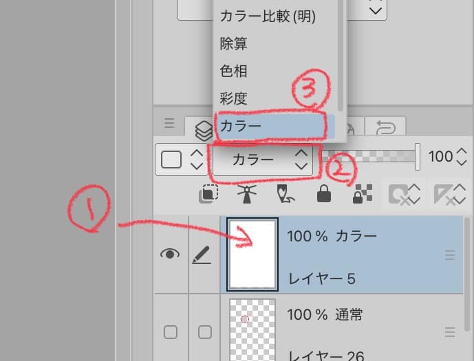
1. Convert your illustration to monochrome
- Create a white–filled layer and put it at the very top
- Change the layer mode to Color
→ Your whole illustration will appear in grayscale
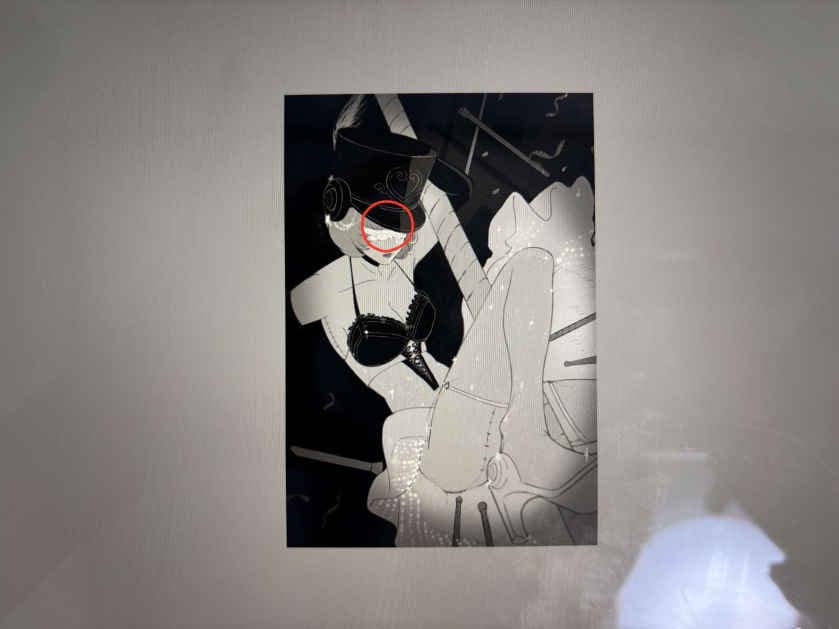
2. Shrink the illustration
A reduced-size image makes high-contrast areas stand out clearly.
Those spots are usually where the viewer’s eyes are going first.
3. If needed, increase or move the strongest contrast
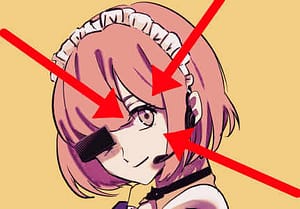
Just increasing contrast in the area you want people to focus on will greatly improve visual flow.
In other words, if you want to draw attention to a character’s eyes, for example, you can outline the highlights around the eyes in black or reduce the contrast difference in other areas…!!
Use shadows to soften the edges where skin directly meets black decorations.
Using the “spotlight effect”
Another method is to brighten only the center of the canvas and darken the surroundings.
It works like stage lighting—the subject naturally pops out.
Simply darkening the edges with a soft multiply layer is often enough to enhance eye-guiding power.
② Controlling the Level of Detail
Best suited for:
- Painterly / semi-realistic rendering
- Soft, delicate linework
Guiding the viewer’s eye isn’t just about brightness and contrast.
The amount of detail you include—or intentionally omit—also plays a major role.
Create contrast through detail density
People’s eyes are also drawn to places with high information density.
But if you render everything with equal detail,
attention gets scattered everywhere.
What matters is creating a difference between areas
with lots of detail and areas with minimal detail.
Example: If you want to draw attention to the face:
- Render eyelashes, eyes, and hair strands more carefully
- Simplify shoulders and clothing
- Use blurred or minimal-line backgrounds to suggest atmosphere only
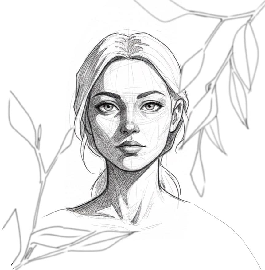
Just doing this makes the face clearly feel like the “main character” of the image.
Conclusion
Eye-guiding is a key element that can elevate the overall quality of your illustrations.
As discussed in this article:
- Use contrast (light–dark difference)
- Create focal points through differences in rendering density
These two techniques help guide the viewer’s gaze exactly where you want it to go.
I hope these tips will be useful as another tool
you can pull out whenever you’re unsure during your next illustration!