Have you ever felt that your illustration is almost finished, but you’re not sure what to fix next?
You keep adjusting textures, cleaning up lines, or tweaking colors—yet something still feels off. Many artists struggle at this exact stage.
After studying explanations from professional illustrators and concept artists (such as critique videos by Naoki Saito), I realized there is a core technique that can dramatically improve illustration quality without adding extra work.
That technique is refining the boundary between positive space and negative space.
Who This Article Is For
- Hobby artists who want to improve their drawings
- Illustrators looking for practical illustration tips
- Artists who want to improve drawing quality without spending more time
What Are Positive Space and Negative Space in Illustration?
In drawing and illustration, shapes can be divided into two major categories.
Positive Space (Positive Shape)
Positive space refers to the actual objects in your drawing:
characters, faces, bodies, hair, clothing, buildings—anything that physically exists in the image.
In short, it’s the silhouette of what you are drawing.
Negative Space (Negative Shape)
Negative space is the empty space surrounding positive shapes.
This includes background areas, gaps between hair strands, and spaces between limbs and the torso.
Although negative space is “empty,” professional artists treat it as a visible shape and design it just as carefully as positive space.
Why High-Contrast Boundaries Matter the Most

The boundary with the strongest contrast determines the quality of the image
What deserves special attention is the boundary between positive and negative shapes—in other words, the contour where the light–dark contrast is strongest.
Areas with strong contrast have high visibility and are the first places the viewer’s eye is drawn to.
If the shape along this boundary is messy or awkward, the entire illustration can feel off, even if other parts are well rendered.
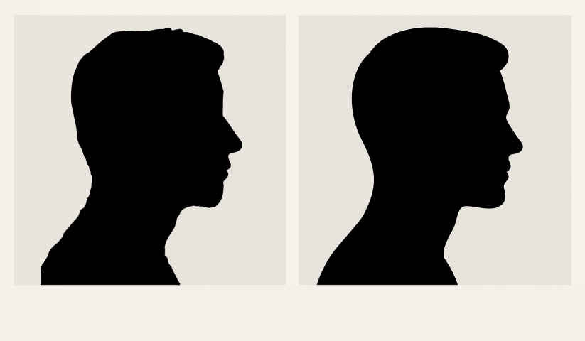
(Left: jagged silhouette / Right: refined silhouette)
I’ve explained the importance of contrast in more detail in this article ↓↓↓
Conversely, simply organizing and beautifying the shape of these boundaries can dramatically improve the overall impression—even if other areas remain somewhat rough.
Conversely, simply organizing and beautifying the shape of these boundaries can dramatically improve the overall impression—even if other areas remain somewhat rough.
These high-contrast edges naturally attract the viewer’s eye first.
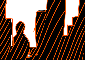
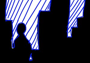
Examples Where Silhouette Adjustment Works Best
- Wings attached to a character
- Leaves, trees, or buildings in the background
- Hair clumps and flowing hair shapes
In many cases, improving only the outline at the light–dark boundary is enough to make these elements look better.
Why This Technique Feels Like a “Cheat Code”
This method is often called a “cheat” because the work itself is simple, yet the impact is huge.
By fixing a small part of the image—the strongest contrast boundary—you can improve the entire illustration at once.
While beginners often focus on rendering details everywhere, professionals prioritize shape clarity and silhouette first.
Summary: The Fastest Way to Improve Illustration Quality
- Focus on the boundary between positive space and negative space
- Pay special attention to high-contrast silhouettes
- Clean shapes matter more than excessive details
If your illustration feels stuck at “almost done,” take a step back and examine the silhouette created by light and dark contrast.
This small adjustment can dramatically refine your artwork and push it to the next level.
If you found this article helpful, please consider giving it a like 👍